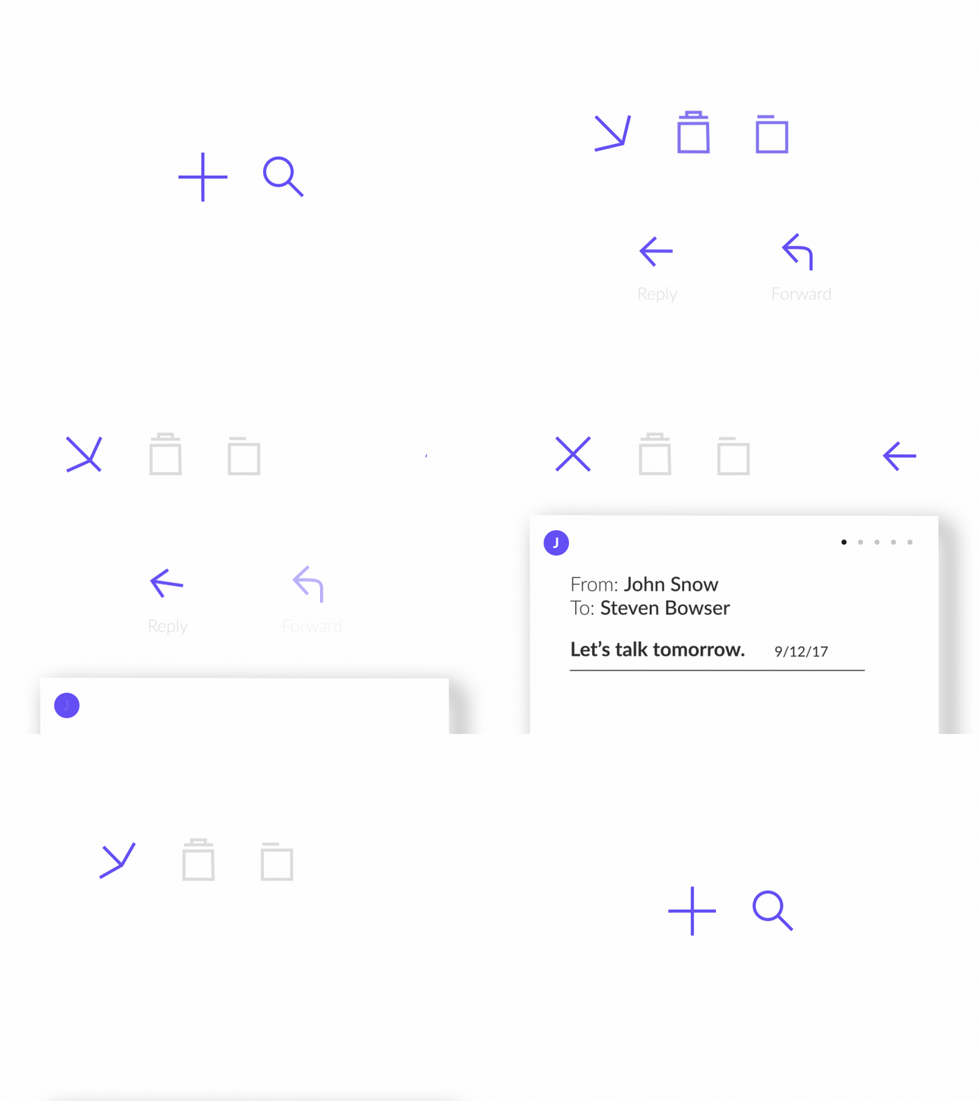
Mobile Mail Experience
Medium: Motion Design
Application: Exercise
Process
For this exercise I worked to make the overall experience practical yet satisfying. Mail apps today can become more of a hassle than a convenience through inefficiency, and lack of organization. Unless you go through a full overhaul of your app's features, you usually get unwanted tabs and folders you don't need; this only makes the overall experience more polluted. Lack of contrast through color, and type hierarchy add to this confusion and really make you wonder why we haven't revamped something thats been around for 40 years.
Sketch to Digital
I chose Apple's Mail App as a skeleton for which I would work to enhance. I started with initial sketches that moved to hi-fi wireframes. I kept in mind certain interactions I wanted to incorperate while keeping consistency through overall composition of elements.
- Wanted to fix/add motion experiences from task to task
- Create hierarchy in alignment, spacing, color and type
- Re-design how you view multiple messages from one recipient
Branding
I chose to create branding around the App in order to be more accurate with type and color hierarchy. I wanted to push a color palette that was built on intention and balance.
- Brand with a purpose
- Action color : Purple
- Theme : Dark Gray / White
- Inactive : Light Gray
- Allow secondary color to easily distinguish between conversions
- Use opacity change over drop shadow within the interface
- Typeface: Lato
- Detailed
- Large Font Family
Details
The motion was designed to feel practical but satisfying.
- Create movement so that a users touch felt intentional.
- Keep weight and color easily distinguished from one task to another


